Design that evolves with the brand
The TLDR;
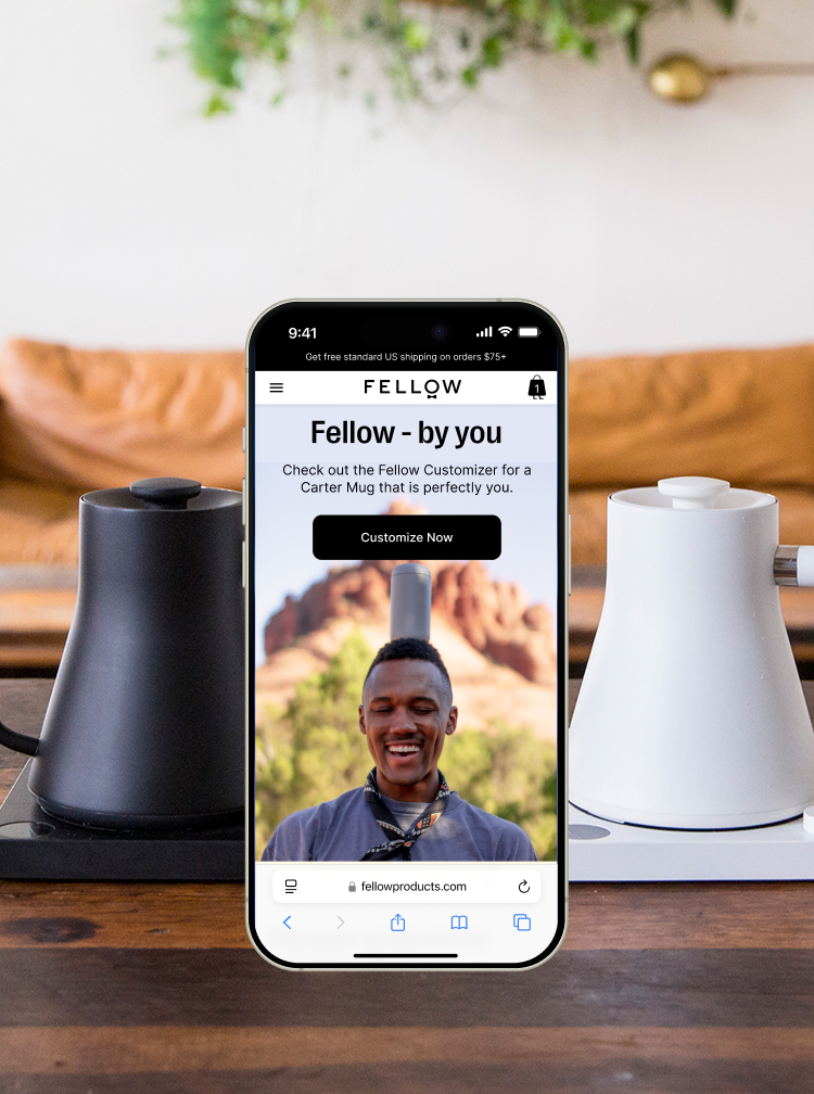
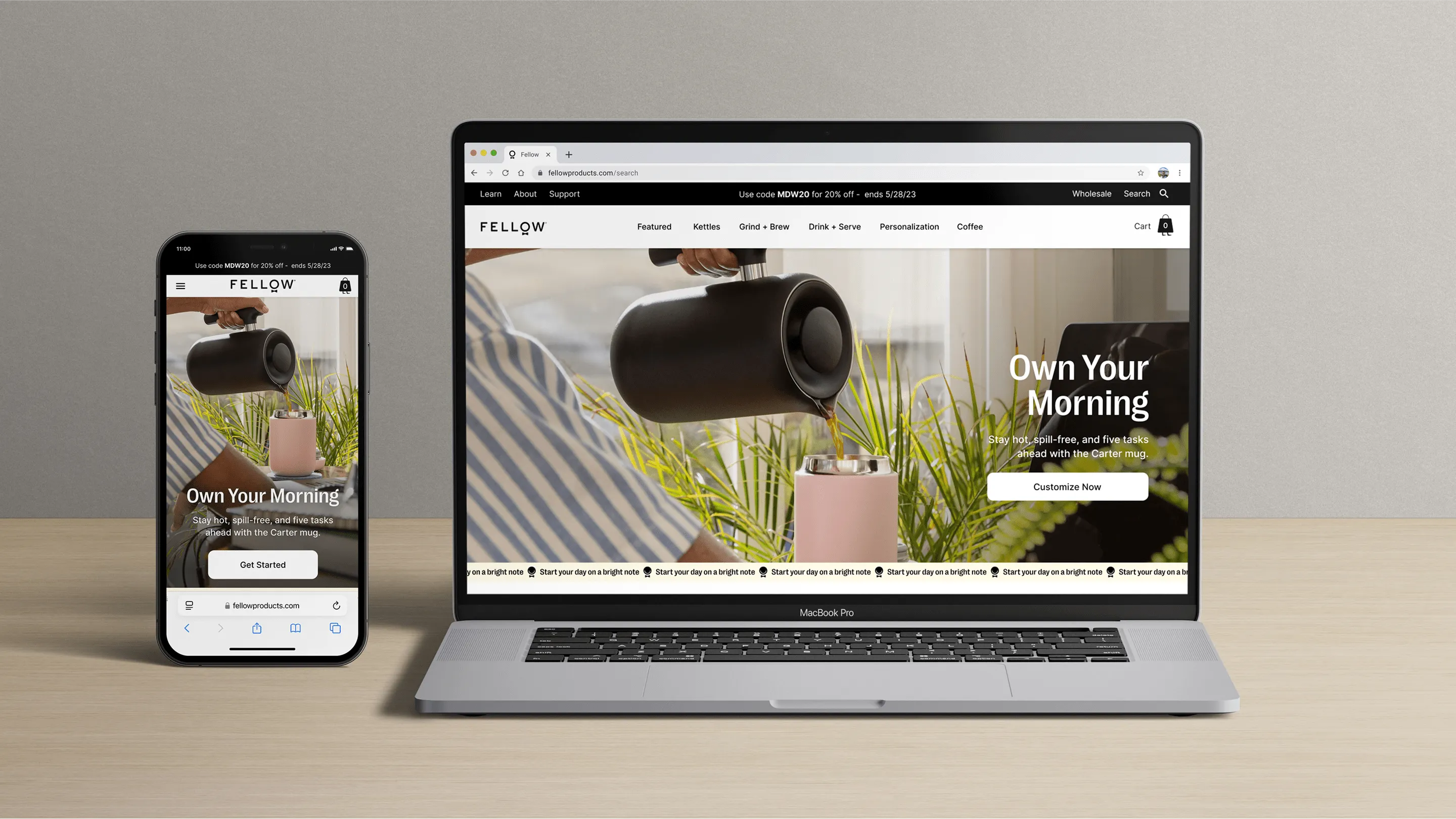
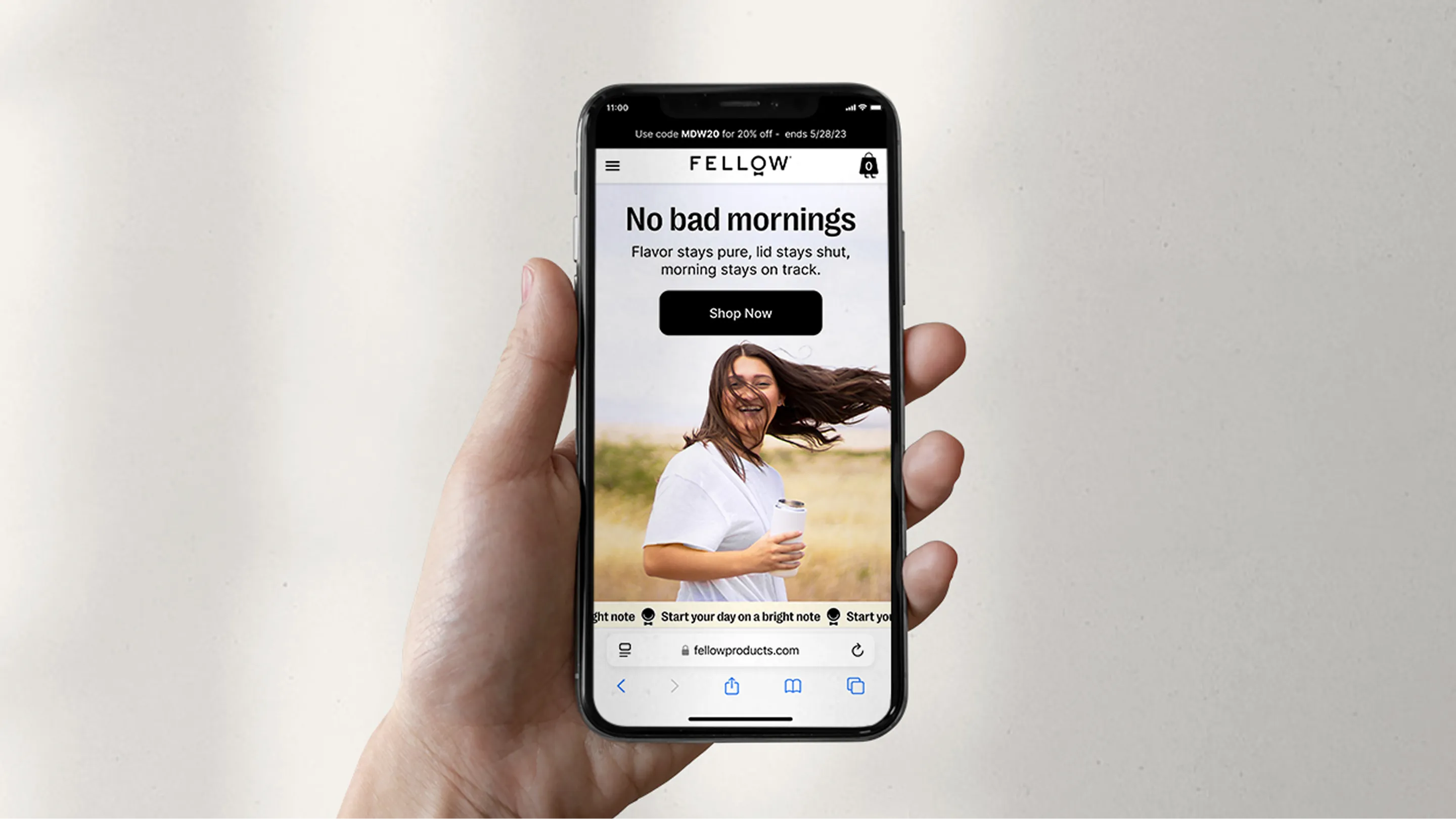
Fellow is known for designing beautiful, high-quality tools for coffee lovers, from their best-selling electric kettles to their precision grinders. Fellow’s online experience wasn’t keeping up with their brand. Their site felt outdated, inconsistent, and too inflexible for how fast the business was moving. I led a full redesign and built a modular design system from the ground up to bring cohesion, and to make shipping new pages 10x faster.
Challenge
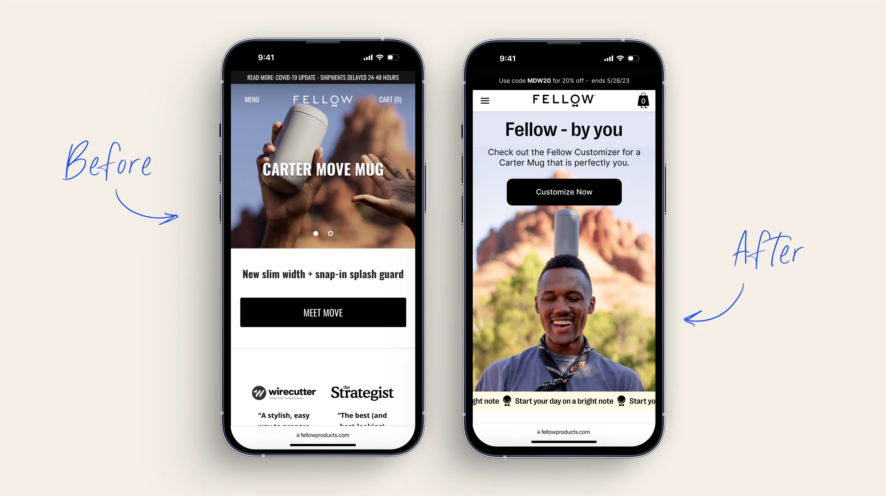
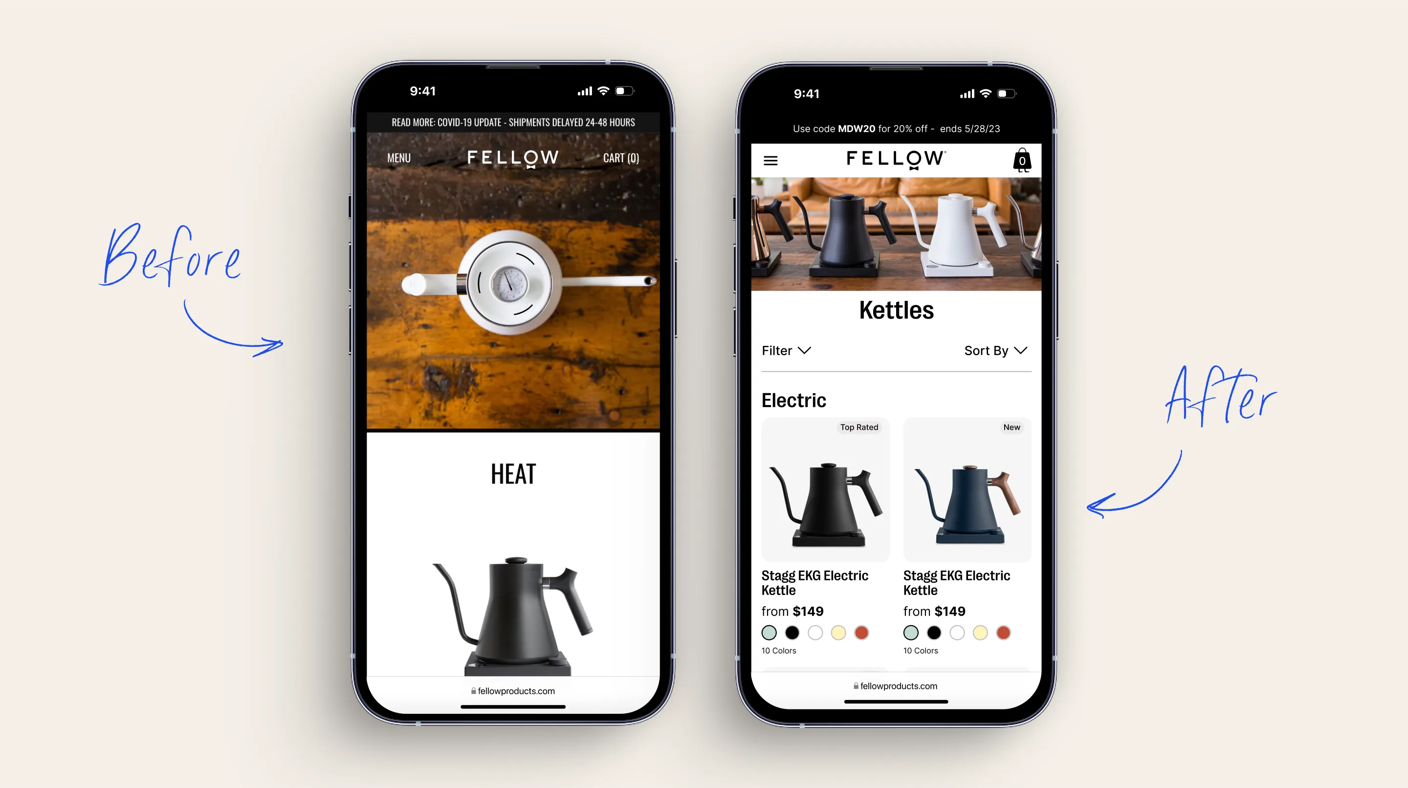
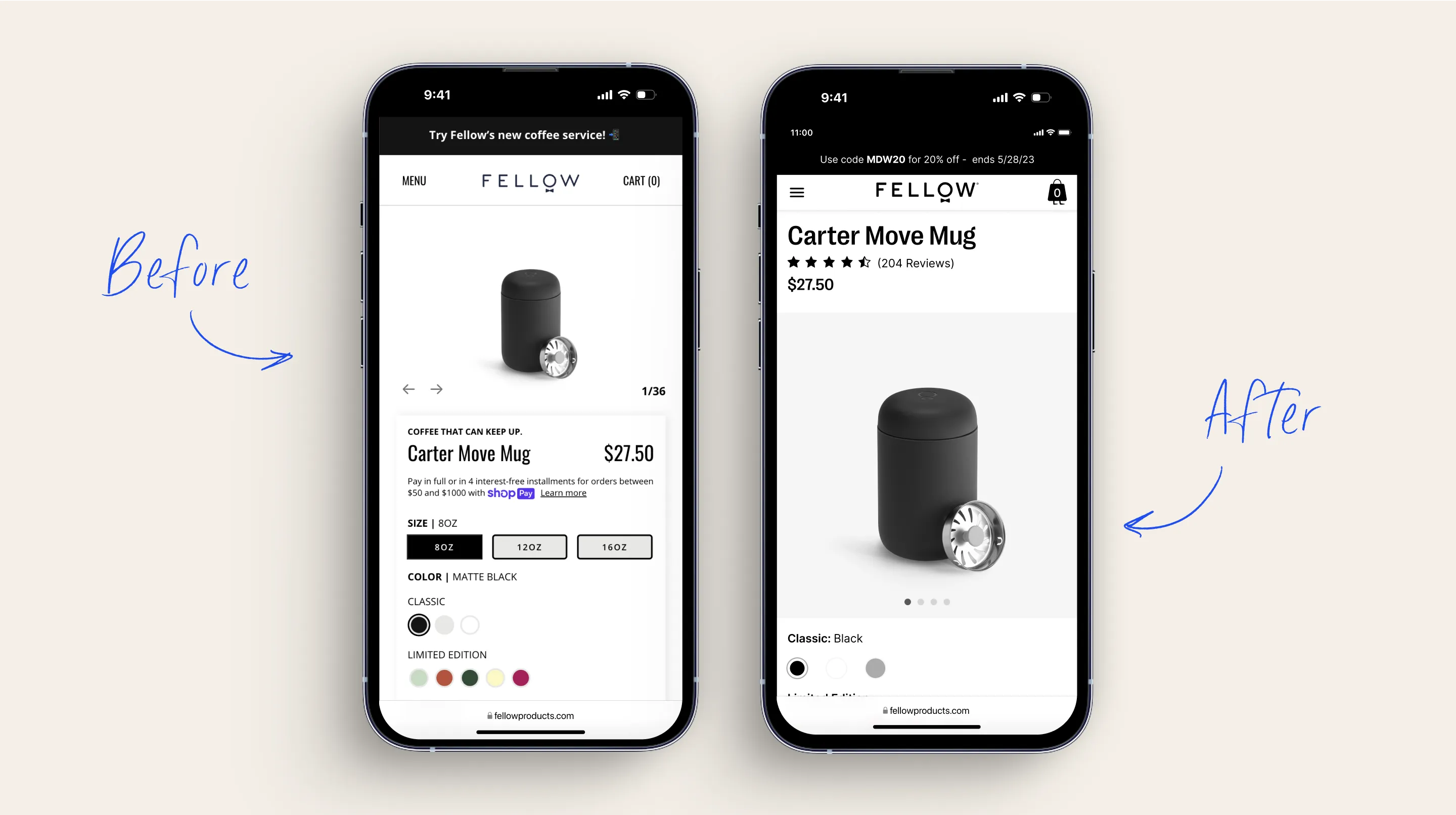
Fellow is known for its sleek, specialty coffee gear. But their site wasn’t doing the product justice and it definitely wasn’t scaling.
Here’s what wasn’t working:
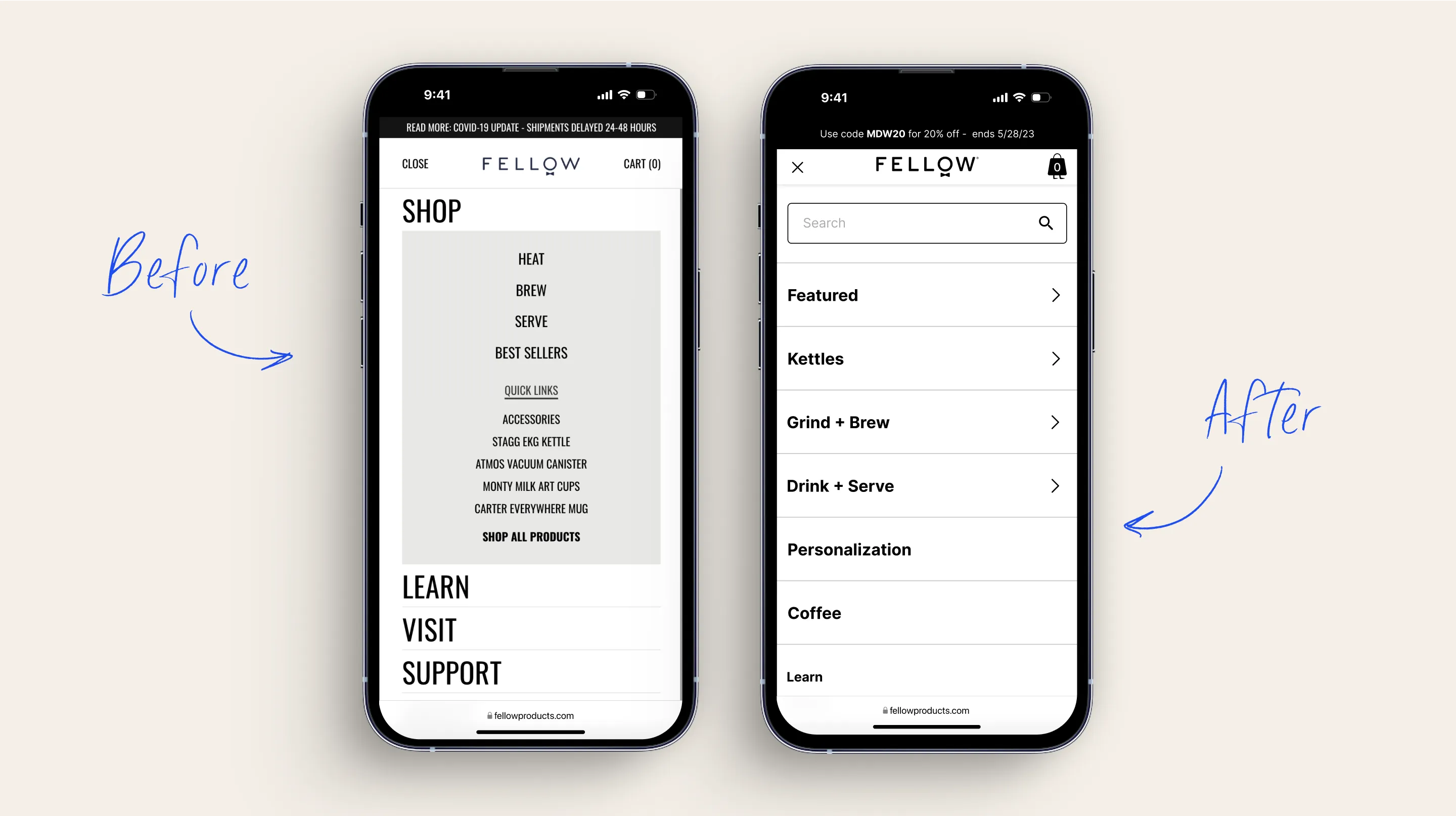
- Pages were being designed in isolation, leading to visual + UX inconsistencies
- The component library was bloated and disorganized with no true source of truth
- New product drops and marketing launches took too long to go live
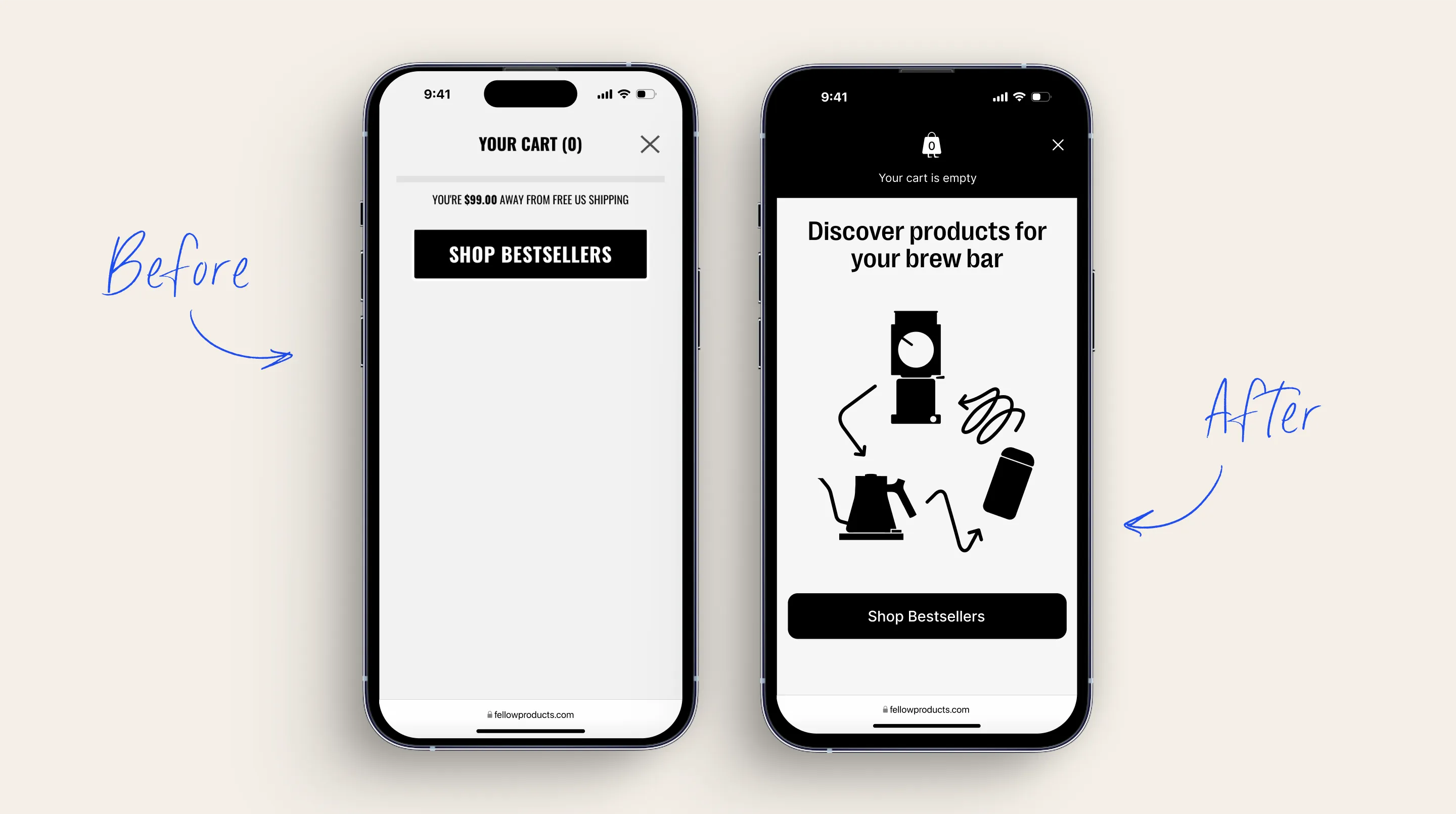
- The site’s look and feel lagged behind the quality of their physical products
Solution
Started with strategy: We ran a UX + content audit to find the biggest gaps in flow, consistency, and brand alignment. Then restructured the IA for clarity across core user journeys.
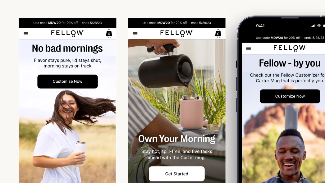
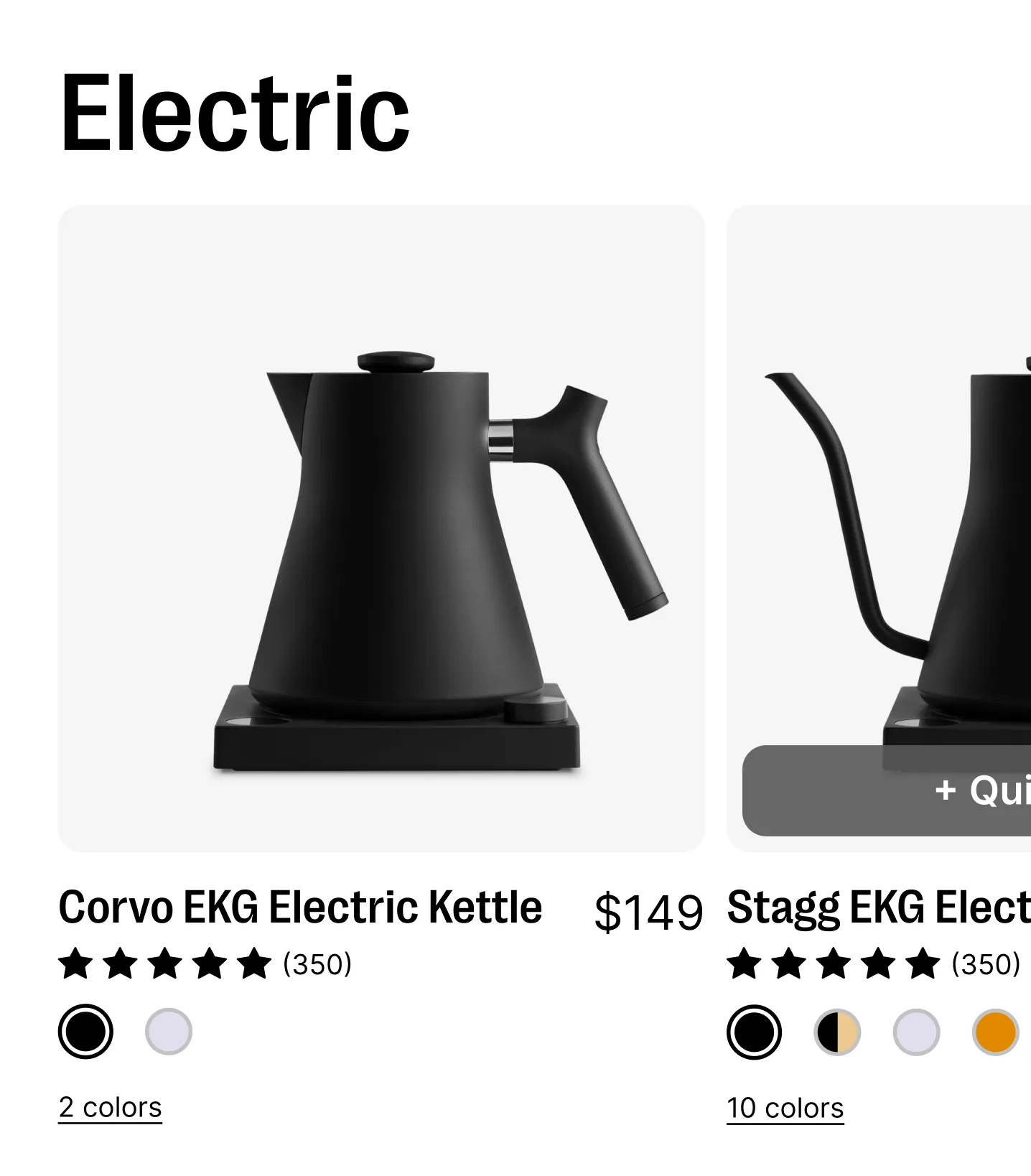
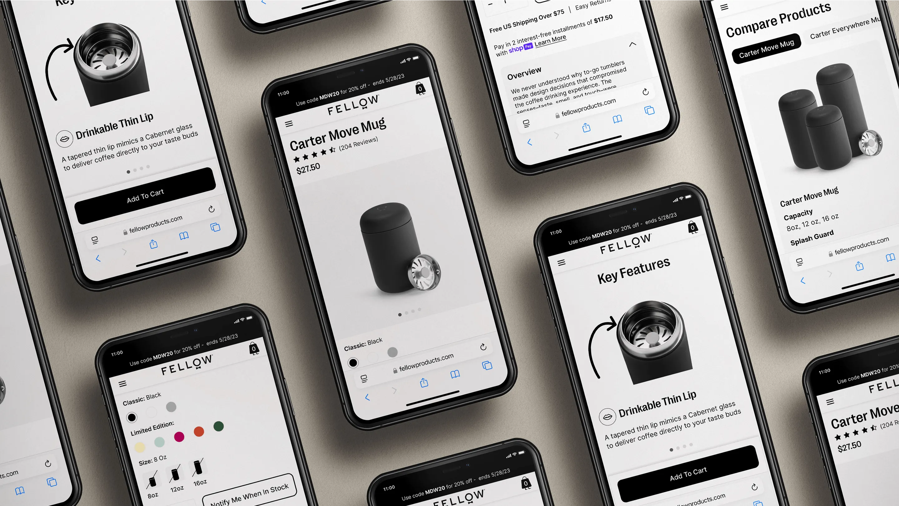
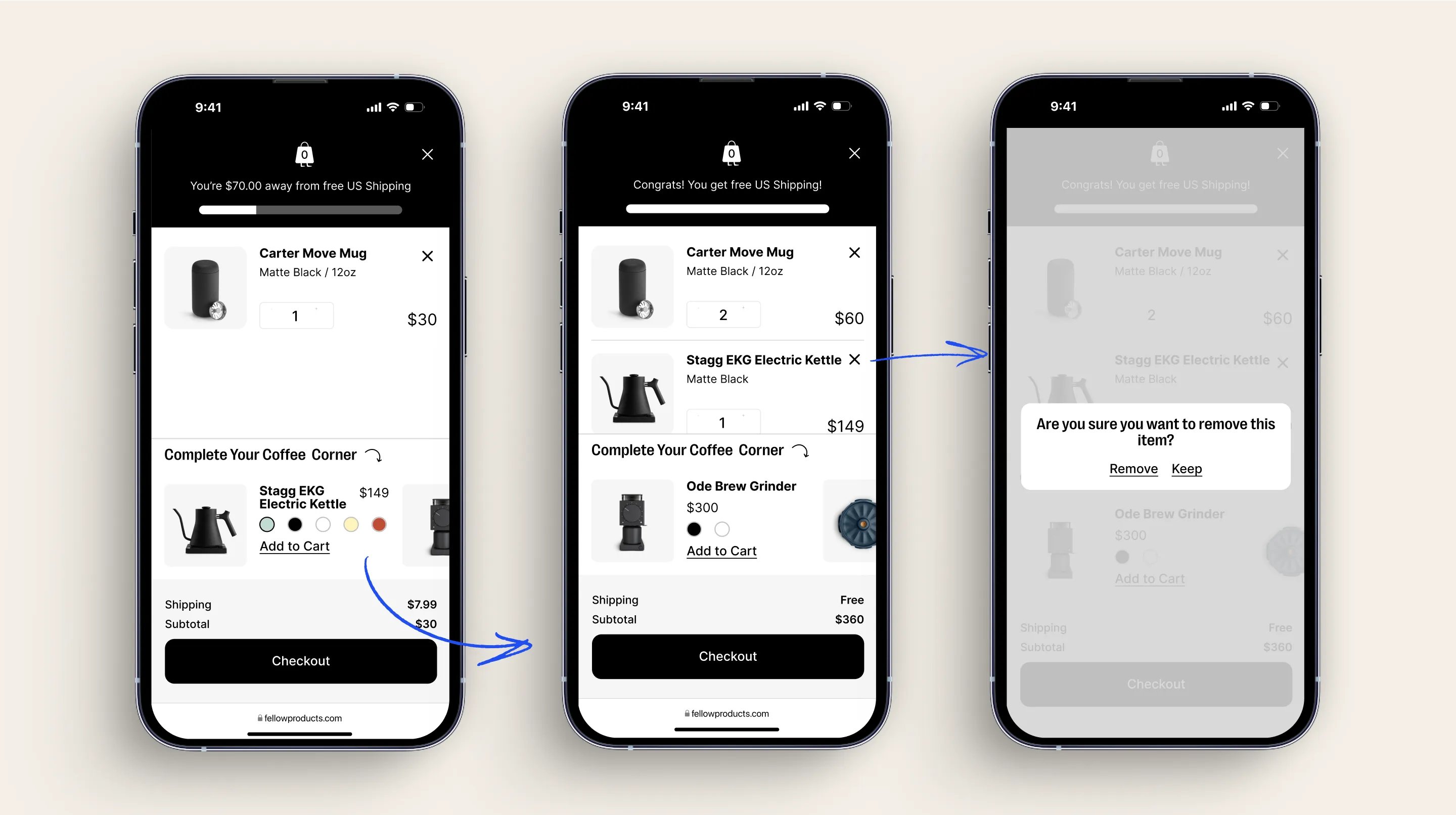
Rebuilt the design system from scratch: We defined what needed to be reusable vs. what could flex, and created a lean, modular system with over 100+ components to serve marketing and PDP needs alike.
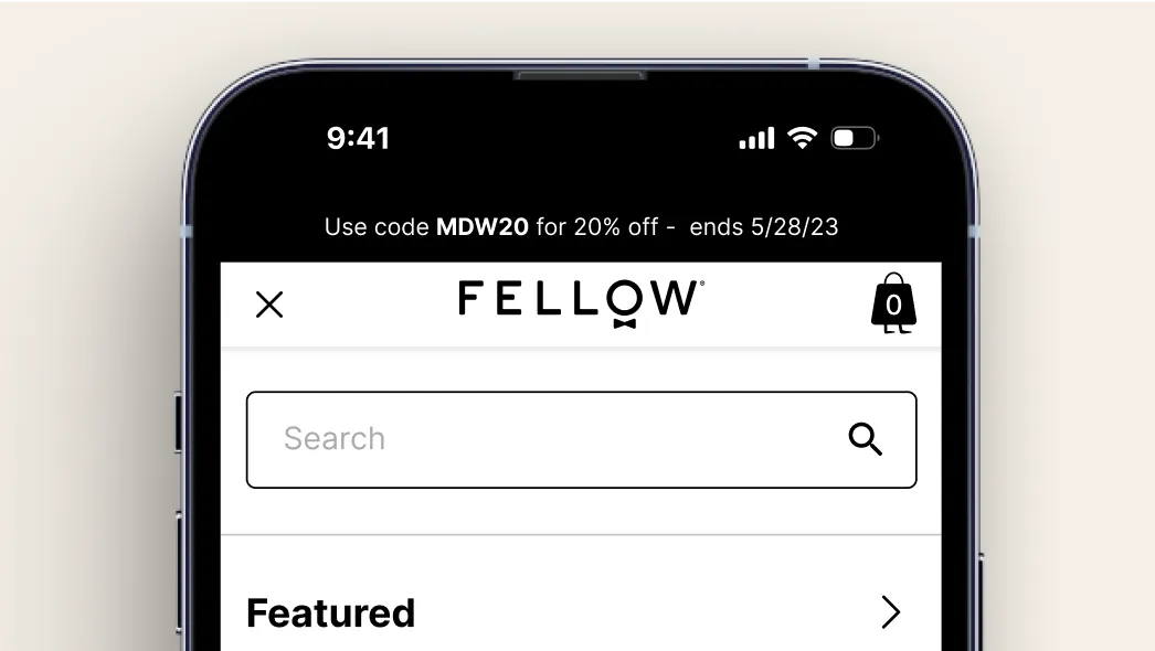
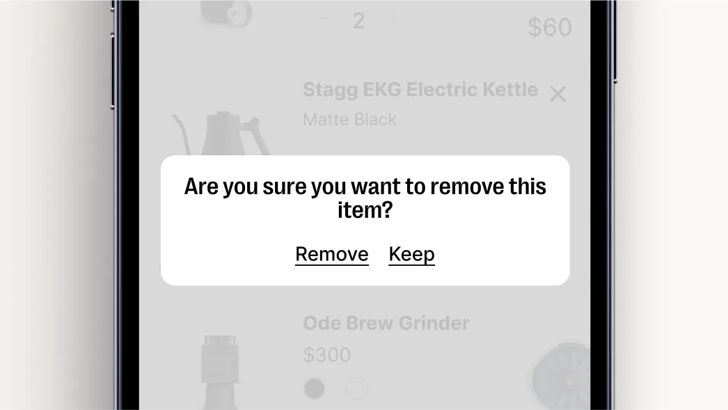
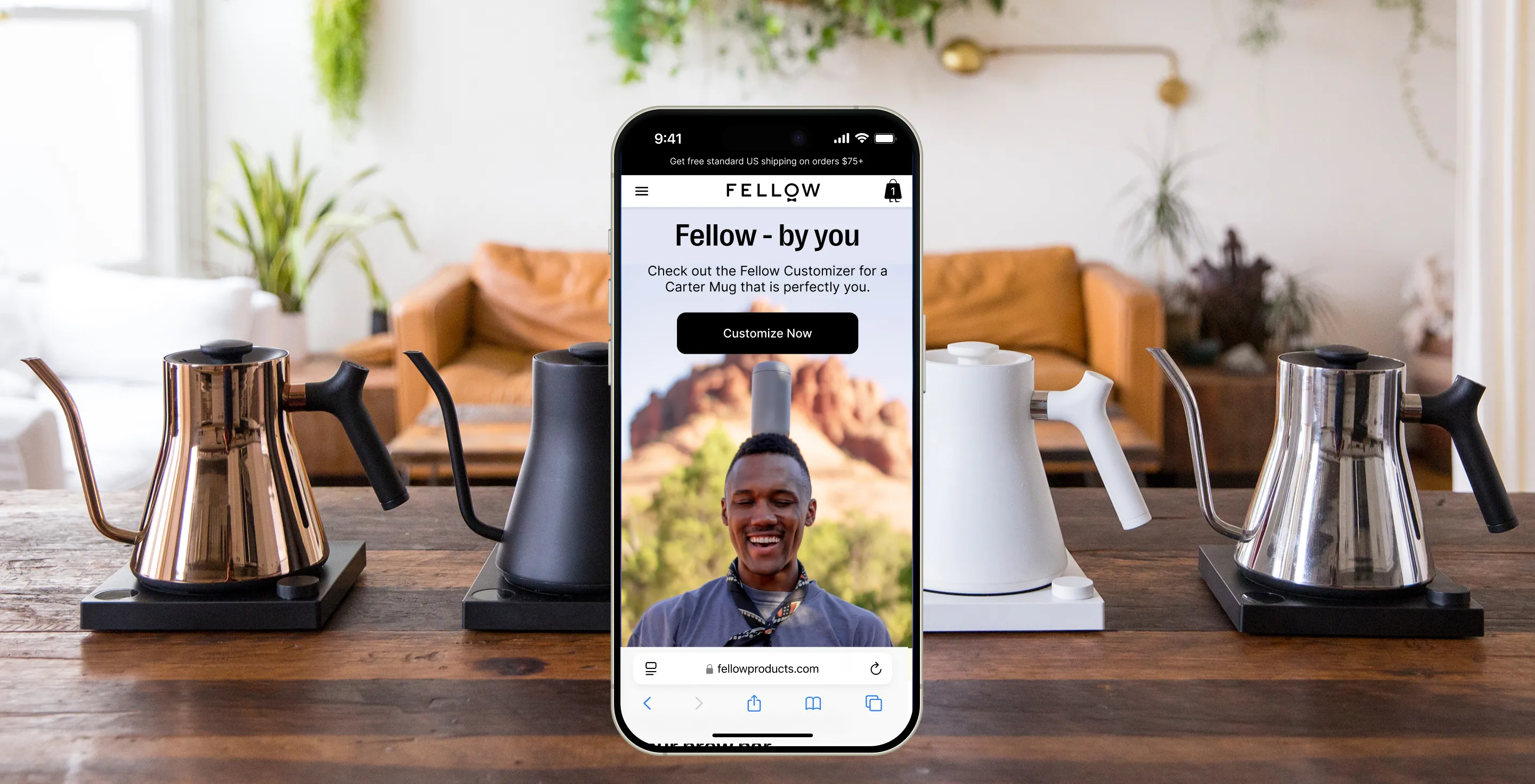
Elevated the design across the board: From homepage to cart, I redesigned the full site to bring stronger hierarchy, better UX, and a visual polish that finally matched the product in people’s hands.
Integrated tightly with the team: I partnered across brand, marketing, and product, ensuring the system wasn’t just beautiful, but usable and adopted by everyone shipping the experience.


Outcomes

3x faster time to ship seasonal or limited-edition launches.

Designers and marketers working from the same system. No more guesswork.

Streamlined mobile experience, with higher conversion in the PDP → Cart flow.
Key Takeaways